A Presentation Design Guide for 2022
If you’ve ever belonged to the audience of a presentation, you might already know the difference between a great presentation and a drab one. Have you ever wondered why some presentations receive a huge applaud while some others simply make the audience feel bored? Obviously, they’re things that can go wrong, but they’re beyond your control. What you can control is the quality of your presentation – one that’s sure to engage any audience.
Put simply, a great presentation takes most of the pressure off the presenter by delivering something people really want to listen to. On the flip side, average presentations make the audience begin to wonder and let boredom prevail.
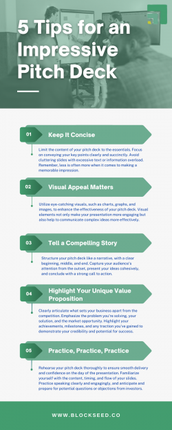
Don’t place your brand reputation at stake with boring presentations. Create a memorable pitch deck by implementing some key design techniques to enhance the quality of your presentation that compels your audience to take immediate action. To help you further, we’ve outlined fourteen key design techniques here that you should implement to make the most out of your presentations in 2019 and rise above the competition.
1. Make your presentation simple and engaging
First of all, you’ve to make the information in your presentation simple enough to help your audience digest it. When it comes to boosting audience engagement, there’re some key tricks like mentioning important facts and statistics, telling a relevant story, sharing a case study, sharing immediately actionable tactics, etc that can help you to a great extent.
2. Focus on the visuals
Nothing makes the audience’s eyes glaze over faster than slide after slide of plain text. Break this monotony of texts by incorporating images, videos, graphs, charts, or anything visual. For any engaging presentation, good storytelling is imperative. And good storytelling can never be complete without the incorporation of visuals as supporting elements of the process.
3. Make the title slide stand out
Your title slide is the calling card for your entire presentation and needs to grab attention while conveying the topic of your presentation. It must offer the audience a reason to sit up and listen. Don’t make it crowded; instead, try to give it a small yet enticing title.
4. Consider the type of visuals
While you can always use stock photos for your presentation, it’s advisable to use original graphics and infographics to increase engagement. If these support elements seem too hard to find, try to use screenshots to make the storytelling more engaging.
5. Demonstrate, don’t describe
Describing the problems and showing the solutions may not help you in every presentation. Try to demonstrate the solutions whenever possible. For instance, if your deck is based on a product, show off its crucial features that would help to solve your audience’s problems. Apart from making your presentation more visually captivating, it’ll enhance your audience’s understanding of what exactly your product can accomplish.
6. Time is of essence
In general, your presentation should last anywhere between 45 and 60 minutes. If your presentation contains a huge number of slides, try to incorporate frame changes every 10 seconds with new points being entered every 30 to 60 seconds to keep the audience attentive and tuned in.
7. Stay consistent
Keep the look of your slides consistent. From fonts, images, background images, color schemes to framing, layout, and logo placement – everything should follow the same style guide while being interesting. Things like using the same title font and same background throughout the design, and implementing consistent fonts, etc can help you attain your goal.
8. Remember the color palettes
Though you can always use corporate, blue tones to give your presentation a cool feeling, bright and vibrant colors are probably your best bet if you’re unsure of which colors to use. If you want to promote your brand, using specific color schemes that contain your brand colors would be a good idea. Also, remember to use images that complement your color palette.
9. One slide – one key idea
Each slide of your presentation design services should state only one key idea, expressed preferably in 6 to 10 words. Keeping the text brief and short not only delivers the intended highlights but helps the audience not to get distracted by the content of your slides.
10. Limit bullet points
Use of bullet point after bullet point is likely to make your audience tuned out. So, limit and use them judiciously to hold the attention of your audience. The most successful presentations don’t necessarily need to be text-heavy with lots of bullet points. Remember that the slides are there to support you – the speaker, and not to make you appear superfluous.
11. Avoid using PowerPoint templates
While it’s obvious to have a consistent visual theme throughout the presentation, try not to use templates included in PowerPoint. Not only have they been seen by the audience countless times, but they also may not be all that great to start with. Don’t make your presentation a cookie-cutter one. Instead, try to incorporate something new (at least for your audience) and unique.
12. Create audience personas
The key to crafting a successful presentation is to let the presentation resonate with your audience. Remember that the more diligently you’ll walk a mile in your audience’s shoes, the easier it’ll become to offer solutions to their most pressing pain points. Incorporating headers like “Challenges and Goals,” “How we can help” etc can be beneficial in this regard.
13. Consider typography
The right selection of typography can go a long way in enhancing the design of your presentation. Use easy-to-read fonts, which would require less attention of your audience to go through, and let them focus on the content instead. In general, traditional font choices like Arial, Helvetica, etc work fine. Remember to use a bold version for the title and a regular version for the body text. Increase readability by keeping the font size big enough (for example 18pt for body texts and 34pt for titles).
14. Use relevant charts
A good presentation shouldn’t be guilty of having too much data in the on-screen charts. Though there’re many ways to exhibit the data in graphic form, different charts cater to different purposes. For example, vertical bar charts are used to display quantity changes over time, horizontal bar charts are used to compare quantities, pie charts are used to display percentages.
The process
While these are the key elements that help a presentation stand out of the pack, there’s a certain process you should follow when designing your presentation. Let’s have a quick look at it.
-
First, plan your content and the key messages you want to convey through your presentation before diving into the designing process.
-
Then start with design basics like selecting color and typography.
-
Now, start working on each individual slide’s layout. Try to bring some variety.
-
Finally, put all the layouts together and see how the presentation flows. Once done, start fine-tuning the design with the help of the above tips.
Final Takeaway
Apart from using the tips mentioned here, try to eliminate anything that can distract your audience. Always remember that the less clutter your slides have, the more powerful the visual message will become. Instead of using your presentation as a kind of autocue, focus on creating visually engaging slides, which reinforce the words coming out of your mouth.
Follow these guidelines and you’ll surely be able to craft presentations that inspire real change and grab attention in today’s age of visual communication.