
Responsive Web Design Project
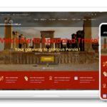
In today’s mobile-first world, having a responsive web design is imperative for ensuring that your website looks and performs well on all devices, from desktops to smartphones. A prime example of responsive web design can be seen in the layout of a standard e-commerce site, which adjusts seamlessly based on screen size.
On a desktop, the site typically features a spacious grid layout showcasing products with high-quality images, detailed descriptions, and easy navigation. As the screen size shrinks to that of a tablet, the design shifts to a slightly condensed view, stacking product images and information for optimal readability. Finally, on mobile devices, the layout transforms into a single-column format, allowing users to scroll effortlessly through products while keeping essential features, such as the search bar and shopping cart, easily accessible.
This fluidity not only enhances user experience but also boosts search engine rankings, as search engines prioritize mobile-friendly sites. By employing a responsive web design approach, your Vancouver-based business can provide a seamless and engaging shopping experience that caters to the diverse preferences of your audience.


