Top Business Intelligence dashboard design best practices (Part One)
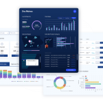
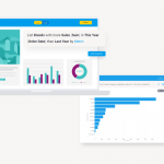
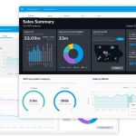
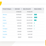
Be careful when using and selecting color in alert dashboard designs. What looks most visually appealing might not be the most helpful for understanding the reports. Color can improve the readability of dashboard charts by drawing the users’ attention to important changes, trends and measures. Higher contrasts between background and foreground colors lead to faster information searching and understanding. But keep the overall aesthetic simple or you’ll overload the user with information.